
| About KEna |
| Screenshots |
| Demo movie |
| Download |
| Documentation |
| News |
| Links |
| License |
|
|
DocumentationOverviewLet's see how KEna looks at startup: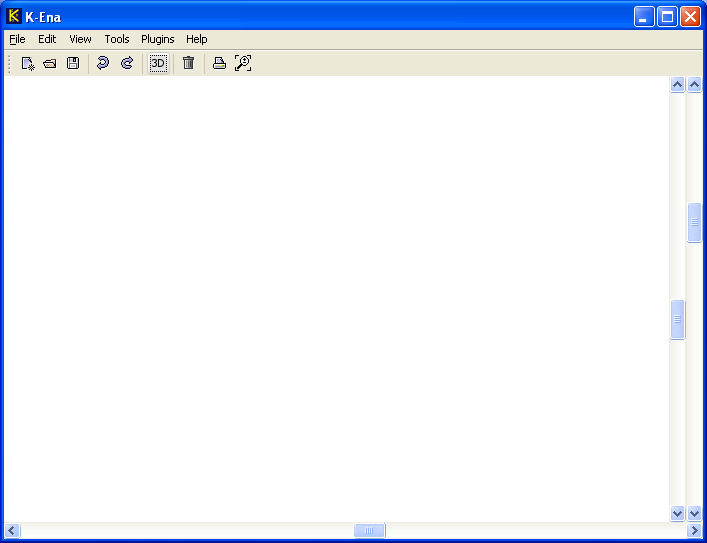
It is an empty window with menu and toolbar. To create anything useful, we have to open a library by selecting option File | Open library.
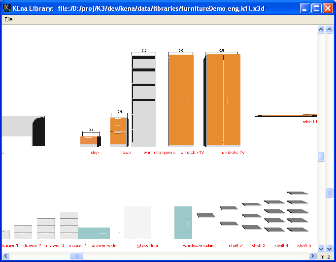
We can see that the bed on the left is inside transparent blue box. This means that we have clicked it and marked for insertion into the model. If we then click in the main window, the bed is added to the model. clicking in the main window. Library window also has more scrollbars than it is usual. Scrollbars marked with 'm' in the bottom right corner move image, while the scrollbar marked with 'z' is used for zooming. After we insert element to model, the main window looks similar to the one below: 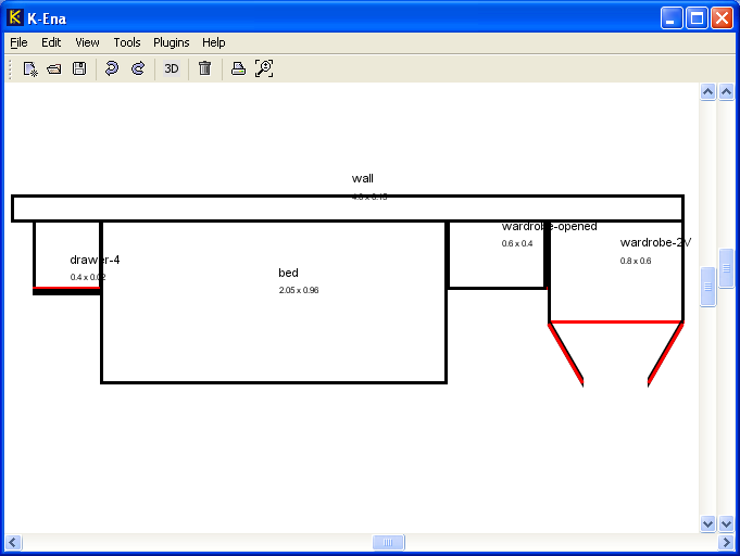
If we didn't do it so far, it is time to save the model. After that we can view 3D image: 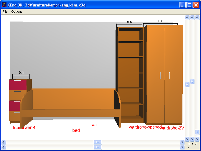
We can see that here we have even two more scrollbars. They are used to rotate the view. How to beginThis section describes few simple steps for starting a new project.
User interfaceThe main application menuThe following menu options are available:
Tool barToolbar contains most often used commands. If we place mouse cursor above button and wait a second or two, a tool tip is displayed, which explains button's purpose. Please see description of commands in menu description above.Navigation2D and 3D views can be moved, rotated and zoomed with scrollbars on the right side and at the bottom of the window. But there exists also faster way. We can move around with mouse wheel and meta keys.2D view
3D view
Library internalsKEna library has exactly the same format as any model. This means that any model can also be used as a library. The only limitation of the current version of KEna is that we have to manually make a 3D view of the model in the same directory ask1m
file is located. This simply means that we display 3D view of the
model with menu option Tools | 3D View. File with the same name as
model file and extension x3d is created in
directory called 3d. Then we use some file
management tool (Windows Explorer for example) to copy the file to the
directory, where the model is located.
It is also true the other way around - any library can be opened in
KEna as model and edited. The only information lost in this process
are XML comments. That's the reason why we should enter comments into
Since editing capabilities of KEna are limited (we can not add or remove parameters for example) library is usually edited in text editor. A good text editor like vi or Emacs is recommended. It is also possible to use Notepad, but any editor, which supports XML format, will make a job much easier.
Library format overviewKEna library uses XML format. XML is not described here, but there are many tutorials available on the net. The first line of library file needs no explanation:
<?xml version="1.0" encoding="UTF-8"?>
Then the following elements are used:
The root elementThe root element is named 'K1Model'. It must contain the following attributes:
     <K3Model name='LivingRooms' ver='1.1'
              author='marko.klopcic@volja.net'
         defaultNamespace='si.mk.k1demo'>
Description elementThis element contains description of the library in human readable text. It is intended for library users and designers. The element should contain attributeshort, which value should be one
short statement describing the library. If we want to provide more
detailed description, we can enter it to element's body as
CDATA section. Usually the short description is intended
for users, while detailed description should describe inner working of
the element in more detail and is therefore more useful to designers.
Example:
<description short='Demo Library, ver 1.3, (C) Marko Klopcic, 1007.'>
    <![CDATA[Details go here. You may add <html> tag at the
             beginning to turn html formatting on.]]>
</description>
Application parametersThis XML element defines parameters, which are available to main application and plugins. They are automatically put to default namespace. Example of such parameter is information about customer, if the model contains furniture for sale. These parameters are not visible to classes and objects. Example:
<appParams>
     <param name = "customerName" type = "string" value = "Jaka"/>
     <param name = "customerAddress" type = "string" value = "1000 Ljubljana"/>
</appParams>
For syntax of parameter definition see the next section.
Classes and objectsThere are two kinds of elements in K1 library - K1Class and K1Object. Elements of type K1Class are not visible, but serve as prototypes for creating visible elements of type K1Object. It is possible to have a library without classes, but usually the good designer will extract common properties of objects into reusable classes.Since the format of class and object elements is almost identical, only class elements will be described. K1Class and K1Object elementsThe root element describes name, version and inheritance relation. Example:
    <K1Class name="Table" ver="1.0" base="FurnitureBase">
    <K1Object name="Table" ver="1.0" base="FurnitureBase">
Description of attributes:
Child elementsBoth elements have the same child elements:
<description>This element describes element. It's syntax is the same as for description element of the library.<params>This section contains parameters, which are later used in other sections, especially in <view2d> and <view3d>. It contains three subsections:<public>,
<protected>, and
<private>. Parameters defined in
<public> section are accessible to other
elements, parameters defined in <protected>
section are accessible to derived elements, and parameters defined
in <private> section are visible only in the
element itself.
Parameters are defined by
<param name = "translation" type="tuple3d" value="0 2 0"/>,we can write: <param name = "distance" value="translation.x"/>Components are referenced as follows:
'value' attribute. See parameter
'color' in the next example.
Example of params section:
   <params>
       <public>
           <param name = "w" value="1"/>
           <param name = "h" value="1"/>
           <param name = "d" value="1.45"/>
           <param name = "translation"  type="tuple3d"  value="0 2 0"/>
           <param name = "rotation"  type="tuple4d"  value="0 1 0 1.571"/>
           <param name = "color" type="color3f" value = "0.85 0.85 0.85"/>
           <param name = "text" type = "string" value='"B4009"'/>
       </public>
       <protected>
           <param name = "weight" value="2.645"/>
           <param name = "doorColor" type="color3f"
                     value="color.r color.g color.b"/>
       </protected>
       <private>
           <param name = "light" type='int' value="1"/>
       </private>
   </params>
Special parametersEvery element must have the following parameters:
There are also additional parameters, which have additional support by the program:
partsThis section references existing elements, which are used as building blocks of the element. Let's see an example, where we used the existing elementBox with parameters w, h, d and
color to create a new element called Tower.
   <K1Class name='Tower' ...

     <parts>
       <element name="bottomBox" src="Box">
           <set name = "translation" value="0 0 0"/>
           <set name = "w" value="w"/>
           <set name = "h" value="(h/3)"/>
           <set name = "d" value="d"/>
           <set name = "color" value="color.r color.g color.b"/>
       </element>
       <element name="middleBox" src="Box">
           <set name = "translation" value="0 (h/3) 0"/>
           <set name = "w" value="(w/2 + h / 2)"/>
           <set name = "h" value="(h/3)"/>
           <set name = "d" value="(d/2)"/>
           <set name = "color" value="color.r color.g color.b"/>
       </element>
       <element name="topBox" src="Box">
           <set name = "translation" value="0 (2*h/3) 0"/>
           <set name = "w" value="(w/4)"/>
           <set name = "h" value="(h/3)"/>
           <set name = "d" value="(d/4)"/>
           <set name = "color" value="color.r color.g color.b"/>
       </element>
     </parts>
   ...
   </K1Class>
Attribute 'src' of tag <element>
must reference the existing element.Attribute 'name' of tag <set>
refers to public parameter of the element Box,
while names of parameters in expression defined by
'value' attribute refer to parameters of the composed
element. For example:
<set name = "h" value="(h/3)"/>
This statement sets the height of included element (Box in our
case) to 1/3 of the height of the composed element (Tower in our
case).
view2dIt is important to understand that 2D and 3D view of an element may not be related. This means that even if we define 3D view, element is not visible in 2D view until we define its 2D view. This approach has a disadvantage of double work, because we have to define 2 views of one element. However, we also have more freedom. For example, 2D view may display elements as symbols or provide additional information important for design, which should not be visible in 3D view.2D view of an element is described in the SVG format. This format is standardized, so we can find more information about it on the net. However, this version of KEna program supports only very limited set of drawing commands:
 <ellipse id="tloris" fill="none" stroke="black" stroke-width="0.02"
                         cx="(w/2)" cy="(-d/2)" rx="(w/2)" ry="(d/2)"/>

 <polygon id="tloris" fill="none" stroke="black" stroke-width="0.02"
   points="$ptLBB.x,$ptLBB.z  $ptLBF.x,$ptLBF.z  $ptRBF.x,$ptRBF.z
           $ptRBB.x,$ptRBB.z"/>

 <line x1="ptLBF.x" y1="ptLBF.z" x2="ptRBF.x" y2="ptRBF.z" stroke="red"
     stroke-width="0.02"/>
All shapes, which have attribute id = "tloris" are
used in overlapping control. Parameters ptLBB, ptLBF, ... in the
example must be defined in <params> section.
The following predefined colors are available for stroke:
ktext. Example:
   <ktext text="%(text)" stroke="black"
             font-size="0.07" x =".03" y = "(-.15)"/>

   <ktext text="$w x $d" stroke="black"
             font-size=".05" x =".03" y = "(-.05)"/>
Element's originWhen designing a new element, a question arises, where should we define elements origin, that's point with coordinate x = 0, y = 0. There are actually 2 main possibilities, each with its advantages and disadvantages. The first possibility is to put origin to one of the elements corners. This simplifies design, because we do not have to divide its width and depth by 2 all the time. When we use snapping, it can be the same as elements resolution. For example, if elements are designed with 1cm accuracy, snapping of 1 cm (0.01 m) is good for correct positioning of all elements, including the ones with odd width or depth. If we have origin in the center of the element, then we need to have snapping set to 0.5 cm. However, central origin has other advantages. Rotating of the element works nicer, and alignments in the properties dialog work better regardless of element's orientation.Central origin is preferred, but program KEna enables us to put origin to other parts of element, if we have a good reason. view3DThis section contains 3D description of elements. KEna was designed to be neutral to 3D format used in this section, but current version only supports XML formats. If we want to use the built-in viewer, only part of X3D specification is currently supported. It is always possible to open the generated 3D output file in other viewers, which implement X3D specification.The following X3D nodes are currently supported:
Examples:
Draw contents of
    <view3D format="x3d">
        <Transform translation='0 -.20 0'>
            <Shape>
                <Appearance>
                    <Material diffuseColor='1 0 0'/>
                </Appearance>
                <Text string='"%(text)"'>
                    <FontStyle size='0.1'/>
                </Text>
            </Shape>
        </Transform>
    </view3D>
Draw box of size w x wallW x d:
    <view3D format='x3d'>
        <Transform translation="$(w/2) $(wallW/2) $(-d/2)">
            <Shape>
                <Box size="$w $wallW $d"/>
                <Appearance>
                    <Material diffuseColor="%color"/>
                </Appearance>
            </Shape>
        </Transform>
    </view3D>
Parameters are referenced the same way as in view2d.
propertiesUIUsually we want to change element's parameters during model design. KEna by default provides dialog for editing default parametersx, y, z, w, h, d, rotation, and two additional ones,
which are used by most elements: color and
text.When this is not enough, and often it is not, designer of elements can give user the possibility to edit other values. This section is intended for definition of additional editing dialogs for editing parameters. Users can access these dialogs from a context menu. Currently there are only limited possibilities for dialog design, so result may not be visually pleasant. However, all parameter types are supported. Example:
    <propertiesUI>
        <panel name = "SizePanel" layout="boxX">
            <editor type = "doubleEditor" text = "Width:" param = "w"/>
            <editor type = "doubleEditor" text = "Depth:" param = "d"/>
        </panel>
        <panel name = "ColorPanel" layout="boxY">
            <editor type = "colorEditor" text = "Color:  " param = "color"/>
        </panel>
        <dialog name = "basicProperties" title = "Size & Color">
            <include panel="SizePanel"/>
            <rigidArea y="15"/>
            <hr/>
            <rigidArea y="15"/>
            <include panel="ColorPanel"/>
            <rigidArea y="15"/>
            <hr/>
        </dialog>
    </propertiesUI>
<panel> tags define panels with editors. The
'name' attribute is used as panel's ID later when dialog is
composed. 'layout'
pluginsKEna supports plugins. This section may contain any information required by plugins. For details please refer to plugins manual, when available.Special elementsSome elements have special status. They contain information needed by all elements or general information for presentation, which applies to whole 3D scene. Their names start with double underscore character. Please do not use this prefix for your elements, because it is reserved for use by developers of KEna.__modelPropertiesClass with name __modelProperties contains parameters, which are visible to all elements in the same namespace. If we combine elements from multiple namespaces in the model, there is also one __modelProperties class for each namespace. It is automatically copied from the library where element was inserted from to the model. Example of such parameter is flag for displaying names of elements in 3D view. Instead of setting this value for all elements, we can turn it on with single setting:<param name = "showNames" type = "int" value = "1"/>The following parameters are used by library browser:
<param name = "minX" value = "-10"/> __headerThis class is used as header of the output file describing 3D view. It may not use parameters defined in __modelProperties in the library. Namespace of __header element changes to the namespace of the model, when it is inserted to the model. It is inserted into the model automatically, when the first element is inserted.__scene_headerThis class describes scene properties of 3D view. See __header for description of parameters and insertion.__selectorThis class enables selection of elements in the library. It must be part of every element, which we want to be selectable. If some element does not contain '__selector', it is visible in the library but can not be selected and inserted into the model. See demo libraries for definition and example of usage.TutorialTemplate classThe first step, when creating a new element is usually copy pasting a similar element or template. One of possible templates is given below:<K1Class name="Box" base="DemoBase"> <params> <public> <param name="w" value='1'/> <param name="h" value='2'/> <param name="d" value='3'/> <param name = "color" type="color3f" value="1 0 1"/> </public> </params> <view2d> <polygon id="tloris" fill="none" stroke="black" stroke-width="0.02" points="$(-w/2),$(-d/2) $(-w/2),$(d/2) $(w/2),$(d/2) $(w/2),$(-d/2)"/> <ktext text="Box" stroke="black" font-size="0.07" x ="0.0" y = "(-.15)"/> <ktext text="$w x $d" stroke="black" font-size=".05" x ="0.0" y = "(-.05)"/> </view2d> <view3d format="x3d"> <Transform translation="0 $(h/2) 0"> <Shape> <Appearance> <Material diffuseColor="%color"/> </Appearance> <Box size='$w $h $d'/> </Shape> </Transform> </view3d> </K1Class>Examples of elements based on this template can be seen in basic.k1l library. Template objectAlthough object elements can contain all data and do not need to be based on a class, it is a good design principle to create a class first, and then set only parameters in objects. Simple example is given below: <K1Object name="box" base = "Box">
<params>
<public>
<param name="w" value='2'/>
</public>
</params>
</K1Object>
Import from other applicationsSince there is currently no support for design of visual presentations in KEna, we can use other applications for this task and then copy-paste data to KEna library. Unfortunately X3D format is not widely supported, but VRML is very similar to X3D, and it is widely supported. So we can export model from other application in VRML format, then edit it in text editor, and copy paste it to KEna library.This technique has been used with Art Of Illusion to create some elements in the furniture library, which you can find in the distribution. Library design by exampleThis section contains simple library with comments, which explain the most important features.
<?xml version="1.0" encoding="UTF-8"?>
<K1Model name='Furniture' ver='0.1' author='Marko Klopcic'
defaultNamespace='si.mk.k1demo'>
<classes>
<K1Class name="__modelProperties">
</K1Class>
<!-- This special class defines information, which is used as --
-- header in 3D output file. -->
<K1Class name="__header">
<view3d format="x3d">
<head>
<meta name='filename' content='sobe.x1l'/>
<meta name='author' content='Marko Klopcic'/>
<meta name='translator' content='/'/>
<meta name='created' content='30 August 2007'/>
<meta name='revised' content='30 August 2007'/>
<meta name='description' content='Library for general rooms.'/>
<meta name='url' content=''/>
<meta name='generator' content='KEna'/>
<meta name='license' content='../../license.html'/>
</head>
</view3d>
</K1Class>
<!-- This special class describes general scene information
according to X3D specification -->
<K1Class name="__scene_header">
<view3d format="x3d">
<Background skyAngle='1.309, 1.571'
skyColor='1 1 1'
groundColor='0 0 0'/>
<NavigationInfo type='"EXAMINE" "ANY"'/>
</view3d>
</K1Class>
<!-- User defined class follows. By convention class names
start with capital letter. -->
<K1Class name="Box">
<params>
<public>
<param name="w" value='1'/>
<param name="h" value='2'/>
<param name="d" value='3'/>
</public>
</params>
<view2d>
<polygon id="tloris" fill="none" stroke="black"
stroke-width="0.02"
points="0,$(-d) 0,0 $w,0 $w,$(-d)"/>
<ktext text="Box" stroke="black" font-size="0.07" x =".03"
y = "(-.15)"/>
<ktext text="$w x $d" stroke="black" font-size=".05" x =".03"
y = "(-.05)"/>
</view2d>
<view3d format="x3d">
<Shape>
<Appearance>
<Material diffuseColor='.1 .9 .9'/>
</Appearance>
<Box size='$w $h $d'/>
</Shape>
</view3d>
</K1Class>
</classes>
<objects>
<!-- Object based on class is defined here - it only changes
parameters. By convention object names start with lower case
letter -->
        <K1Object name="box" base = "Box">
            <params>
                <public>
                    <param name="w" value='2'/>
                </public>
            </params>
        </K1Object>
</objects>
</K1Model>
|
|
Contact: 
© Marko Klopčič, 2003-2007 |